

Packaging Illustrations for Functional Chocolate Company
FUNCHO is a new brand of healthy chocolate. The goal of each bar is to provide nutrients and vitamins to support you through any situation. For the initial launch, there are four bars available: Carefree Chocolate, Hot Chocolate, Rhythm Chocolate, and Sexy Chocolate.
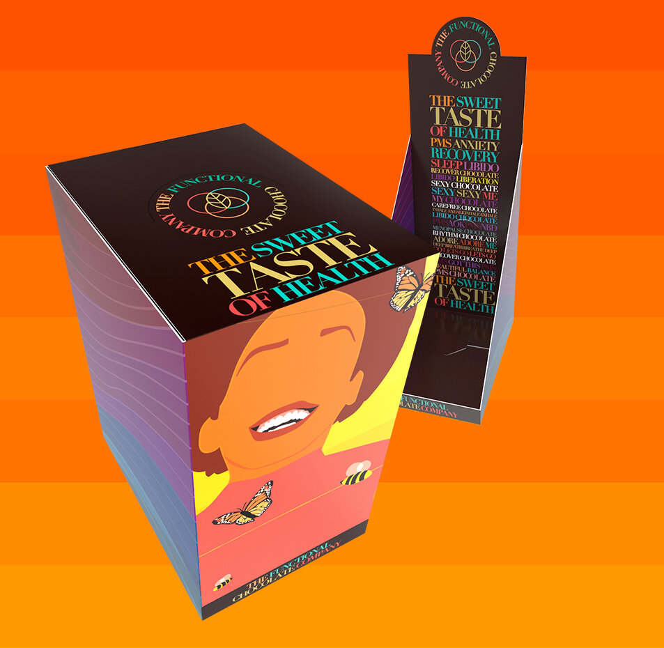
The Ask: Concept and execute original illustrations to be used as the artwork for a new chocolate brand, launching February 2021.
The Execution: Four complete designs, made with adobe illustrator with inspiration from the chocolate bars themselves. I worked with an incredible team at FUNCHO. Art director Steve Whittier helped with the production and packaging design.
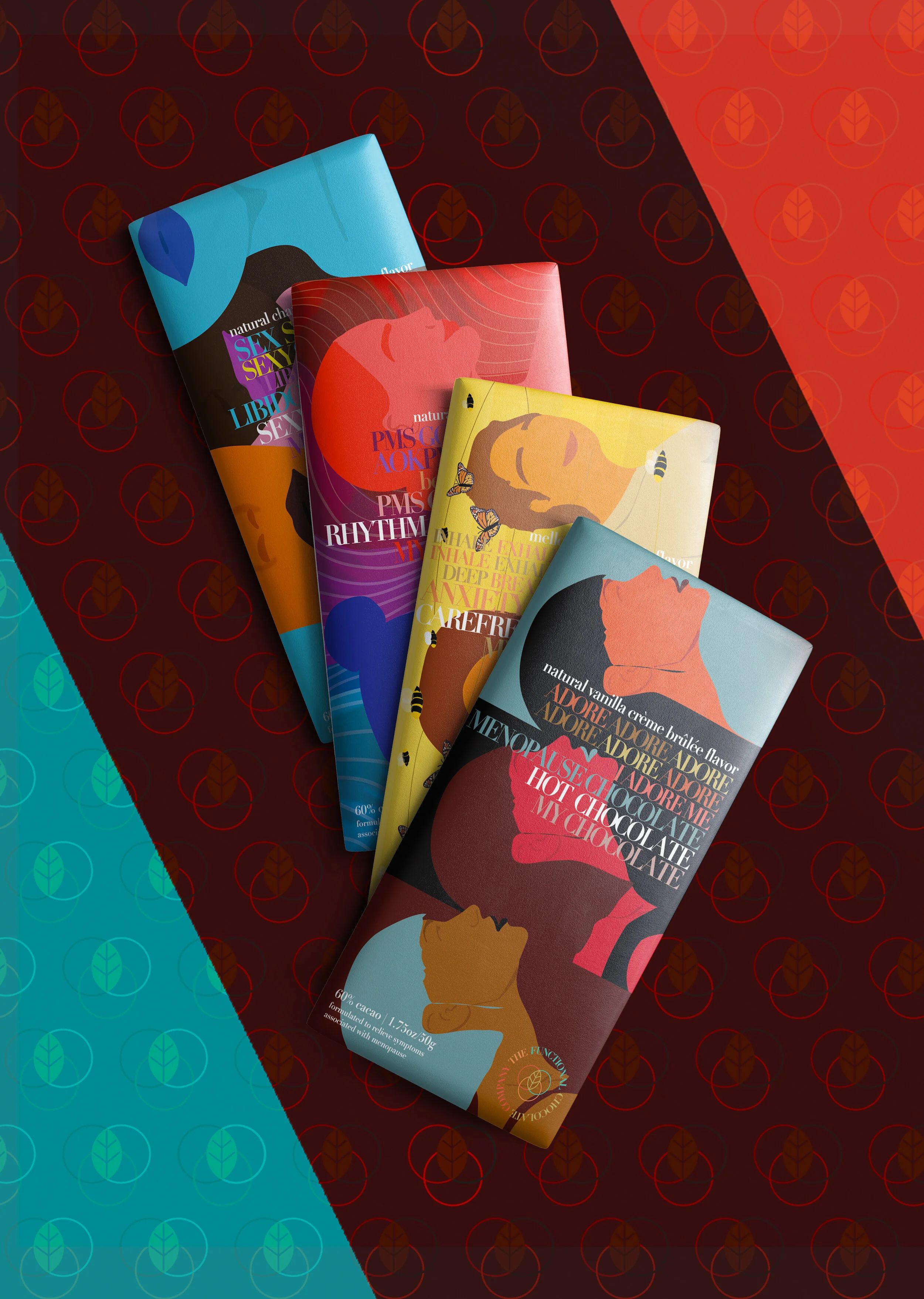
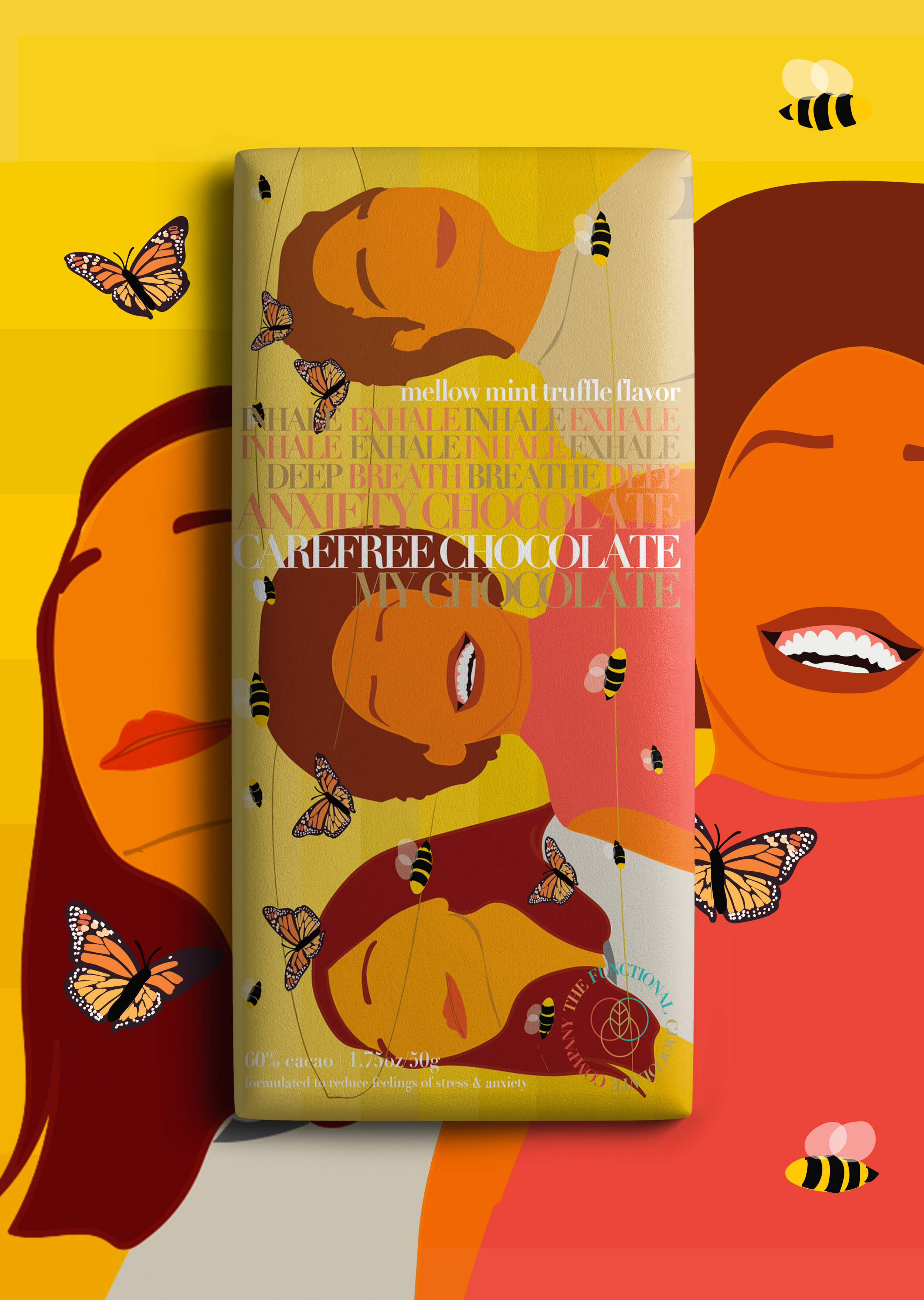
Carefree Chocolate
The process of designing this bar began with inspiration from my own experiences with anxiety. The bar’s purpose is to alleviate feelings of anxiety and provide a calming relief.
My thought process behind the design was portraying the sense of relief and happiness amongst the chaos. Anxiety can produce a sense of vibration in a person, a little “buzz” that doesn’t go away (hence, the bees). The illustration is meant to mimic that feeling, but turning it into something beautiful and relaxing. That’s where the butterflies play their part. The color palette is a simple “happy” color scheme, as the color yellow and its sister tones are often associated with joy.
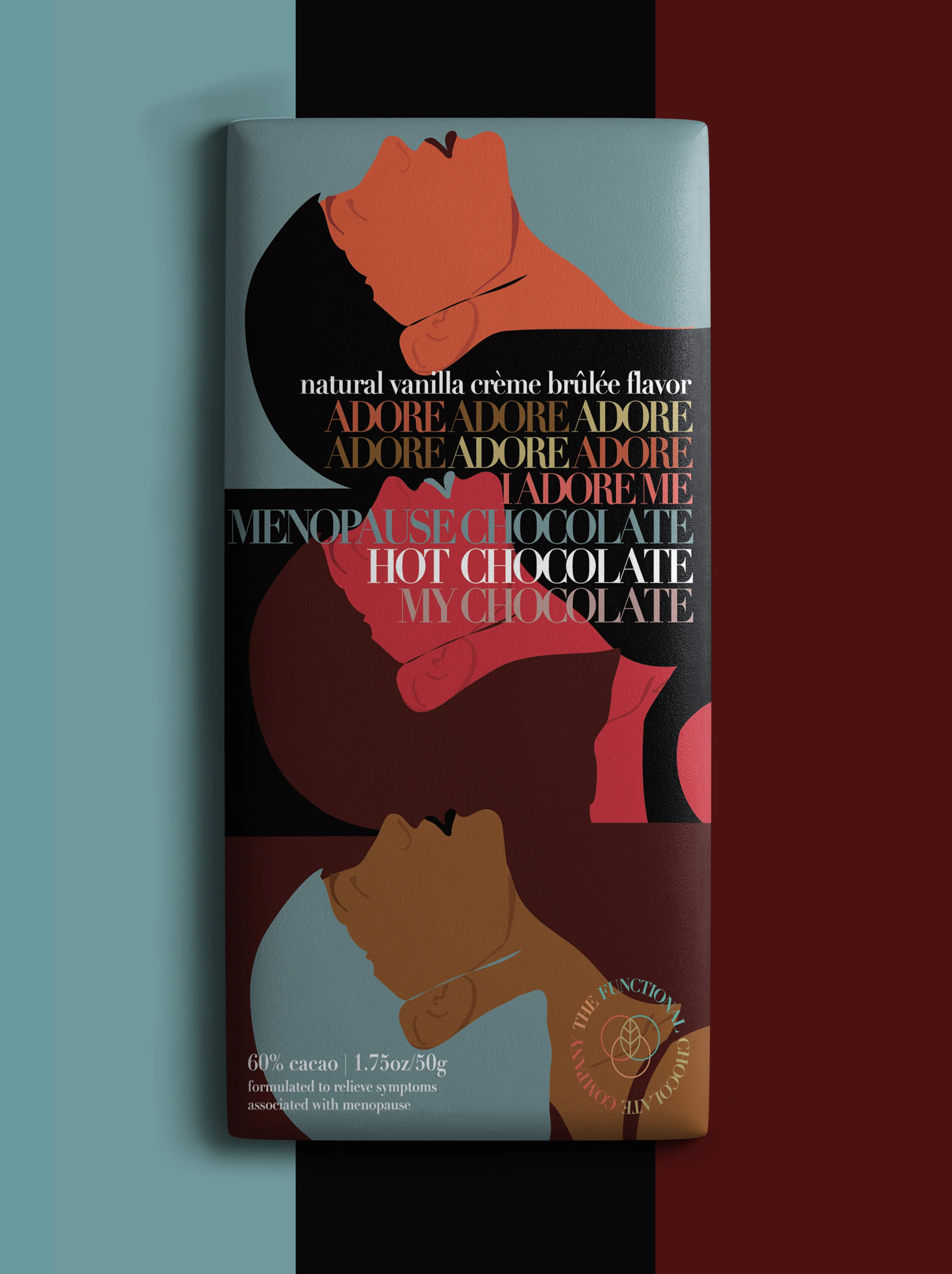
Hot Chocolate
This bar is packed with vitamins to restore some sense of comfort for women going through menopause. This design is meant to mimic the stages of a woman’s life and the beauty in each stage.
The design was made to create a progression pattern in which the woman experiences different phases of life, and each is as important as the last.
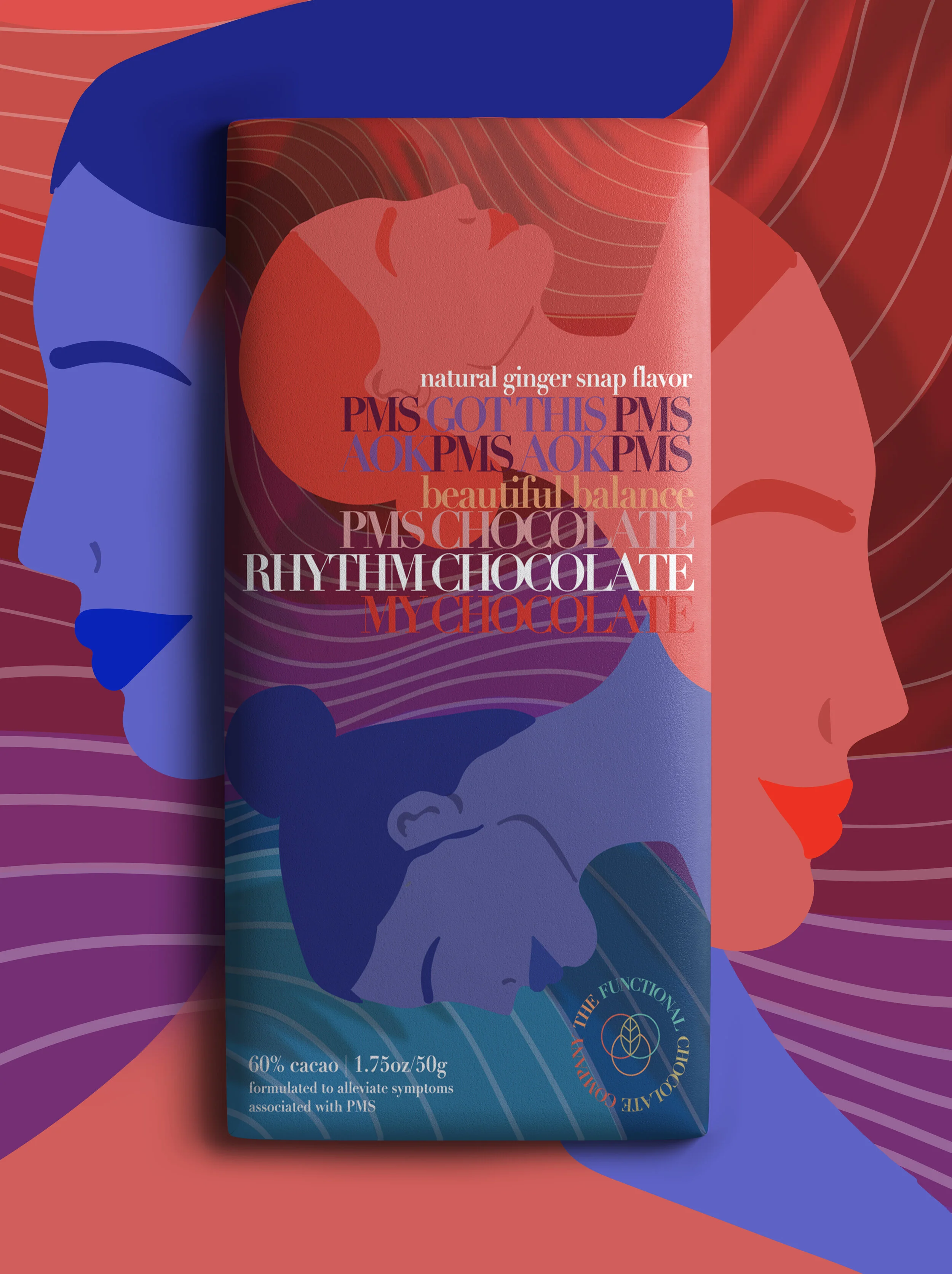
Rhythm Chocolate
Though the name may point you in another direction (music) this bar is for the one thing that throws women off their rhythm once a month: PMS. This chocolate bar is meant to restore balance in your moods and emotions, while also satisfying that chocolate craving.
For this design, I took the name and the purpose and combined them into a unified feeling. The color palette of reds, purples, and blues is meant to resemble the mood swings and flows in-and-out of emotions. The two women are clearly experiencing different feelings, but the goal is to not know which is which. And even though they’re exerting different colors, there is a balance and rhythm to the design that mimics the effects of the chocolate.
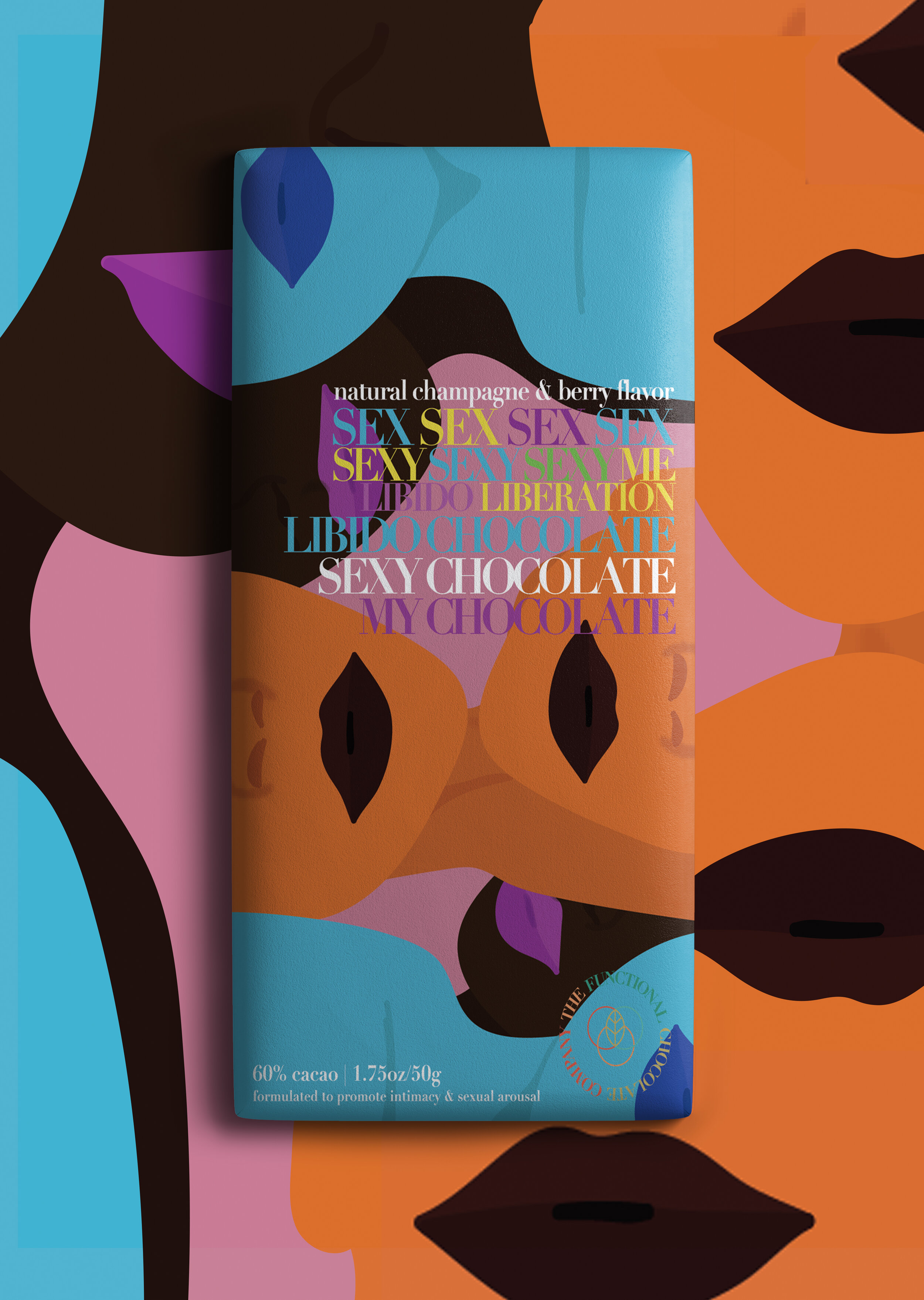
Sexy Chocolate
It’s right there in the name: this chocolate is for libido. This bar is meant to make you feel sexy.
To mimic that feeling, I went with a contrasting, “all over the place” design. Different shaped figures, upside down and right-side-up, with a special emphasis on the lips.